Business Problem
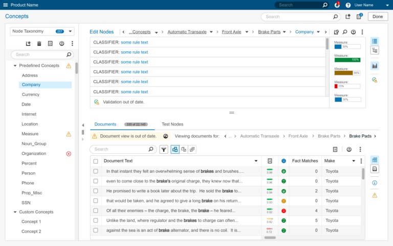
Building analytical models in this product involved a series of code, compile and evaluate actions, often occurring once per minute. Each code change altered model performance. But did performance improve or degrade? There were no clear indicators, leaving users to muddle through and hope for the best.
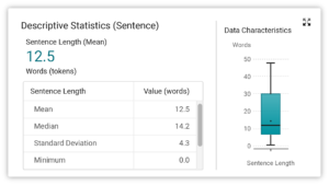
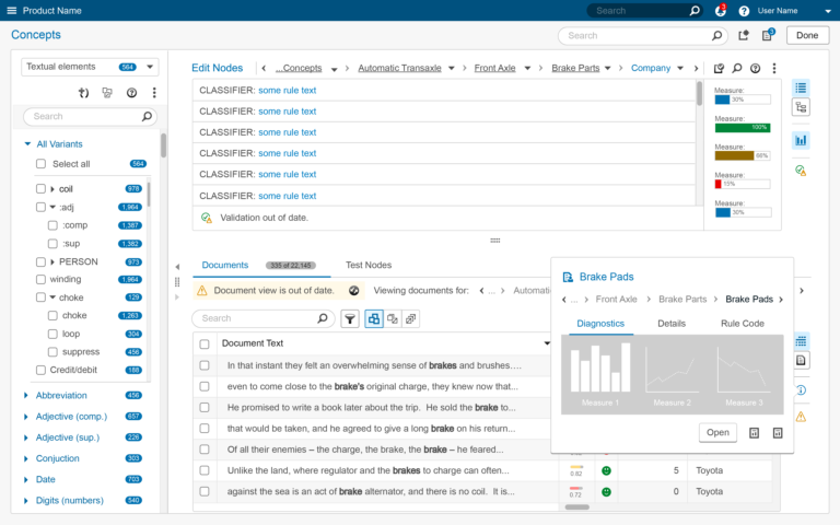
Frustrated customers and proxy users (internal Consultants and subject matter experts), demanded the addition of “Diagnostic Plots”, indicators illustrating model performance. What measures were considered “diagnostic” of model performance and where should they be placed to be most useful?

User Research
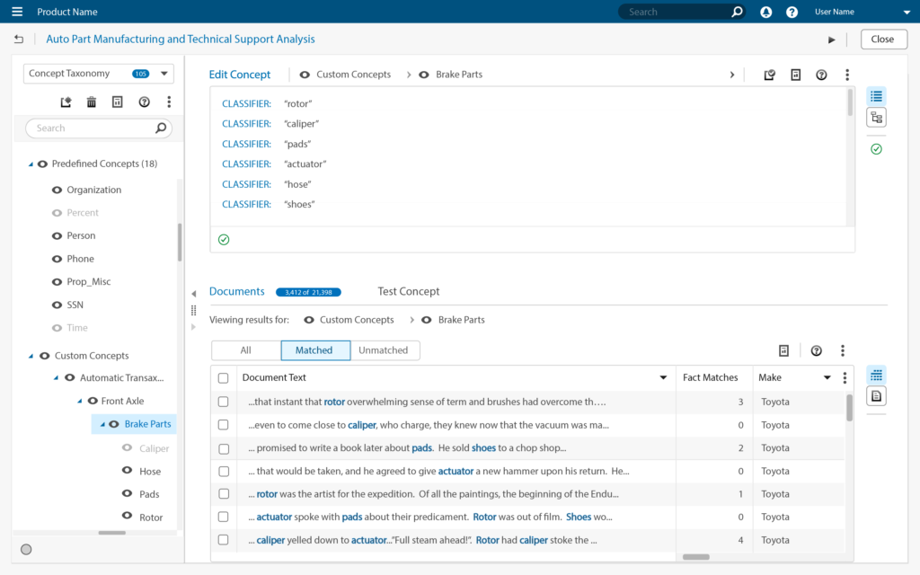
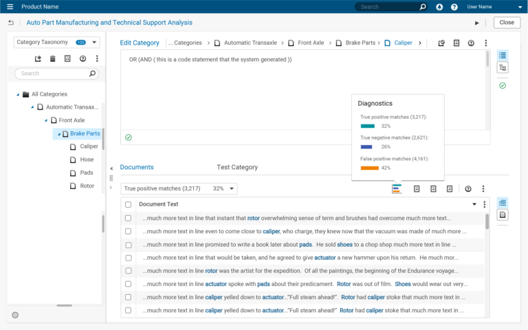
Proxy users were interviewed to understand both questions. Users mentioned that indicators should be readily visible from either the coding or Documents panels where they could be acted on during model coding.
What constituted a diagnostic, however, wasn’t clear. User’s knew they wanted something, but they couldn’t articulate what that was. Finding the answer wasn’t going to be a straightforward exercise. Making room for it in the existing interface wasn’t going to be a straightforward exercise, either.


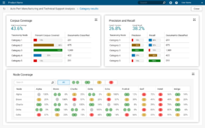
Users knew they wanted indicators, but what would suffice? What measurements or variables would drive the indicators? A few statistical measurements were suggested, most seemed to describe Precision, Recall, and Type I and Type II statistical errors. Beyond generic descriptions, the best answer was “I know it when I see it.”
Additional interviews were conducted to delve more deeply into user goals and activities. Coding, post-processing, and result de-duplicating activities were investigated. Users frequently complained about these activities, and a deeper understanding uncovered more details.
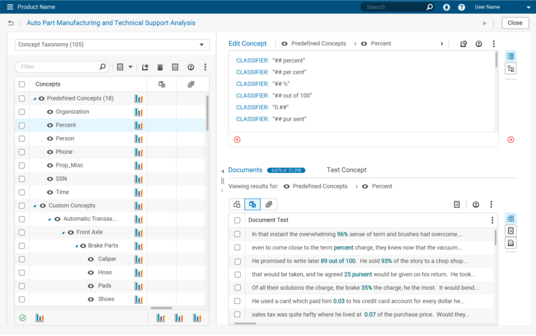
- Ensuring that code rules categorized all the text within a document corpus;
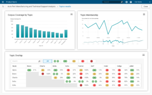
- Ensuring that categories were unique and not overlapping;
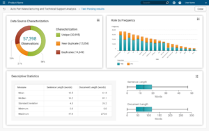
- Understanding the frequency of term use within the corpus;
- Understanding the Precision and Recall measures for each rule;
- Understanding the number of documents classified for each rule;
Now we were getting somewhere.

Design Concepts
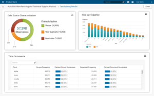
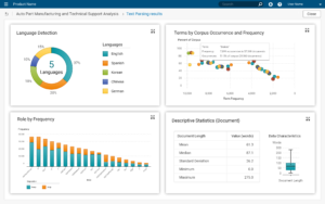
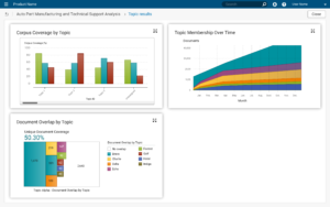
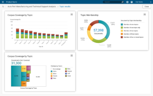
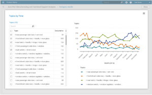
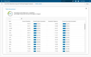
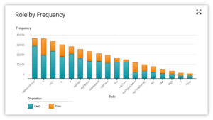
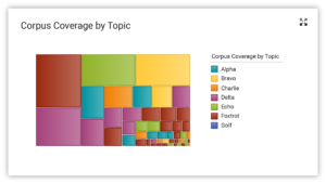
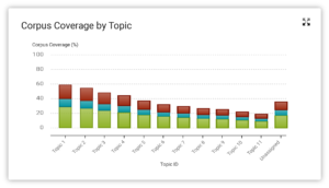
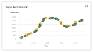
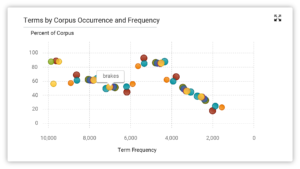
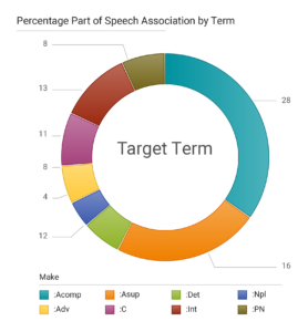
The Visual Design team produced a number of assets which UX Designers were encouraged to use within their designs. Among these were examples of common graph components produced by an internal graph team.
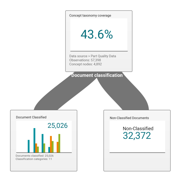
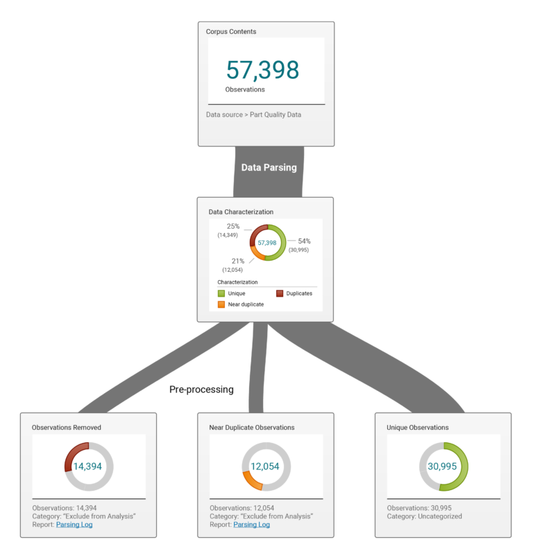
Using these examples, I modified them to reflect the feedback from users, and arranged them to fit the platform design and the company style guide. Examples were reviewed by users, along with the Product and Development teams to elicit feedback.
Users and Product teams felt the displays were helpful and encouraged further development.
Design Concepts Gallery
The Development team was not so encouraging, however. Mid-tier systems could not produce the variables required to display the output. Major changes to back-end systems would be required, but the Development team did not have the desire, nor the capacity to make those changes within the foreseeable future.
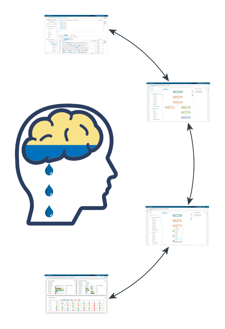
While I agreed that Diagnostic measures were important, I did not agree with their proposed placement. The proposed placement was in “Results” section within a common platform environment. Viewing these displays required two lengthy navigation steps into another area of the application. Human memory would not survive the trip. Results located in this area would be useless.
The graphic below describes the problem and illustrates the steps between the task and the display.
These are task support displays. Distant placement does not provide task support.
Viewing these displays required two navigation steps. Navigation takes time. Working memory starts decaying.
Displays generate when called. Generation requires several seconds. Working memory decays further.
From a human factors perspective, this is not acceptable, as these displays are neither helpful, nor useful. The displays must be adjacent to where the work is performed.
Alternative Efforts
According to the Development team, they would not create the variables necessary to drive the graph component displays. This was partly due to scheduling backlogs, and partly due to other longstanding issues that puzzled and frustrated many.
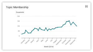
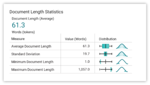
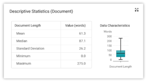
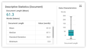
Past versions of the product had some basic diagnostic indicators. The ever static mid-tier code calculated these values. The display could be redesigned and integrated into the existing interface.
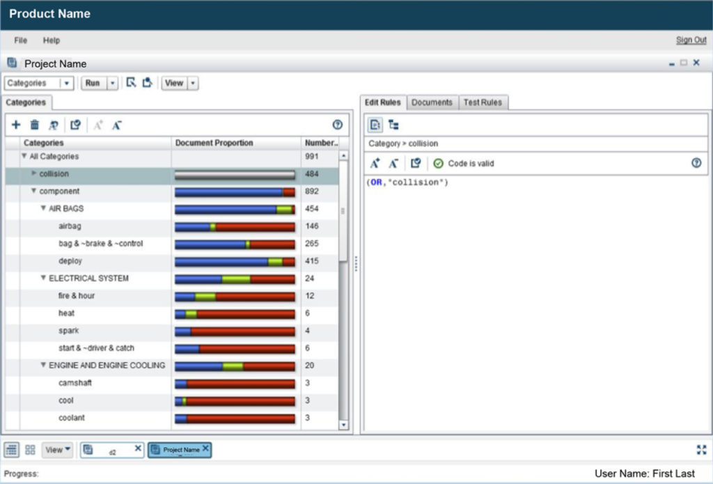
Alternative Efforts Gallery
Alternative efforts sought to create displays driven by existing variables. Several locations were proposed for placement. Although technically feasible and making use of what was available, Development made no effort to implement these examples. No rationale was provided.
Outcome

Products are not static structures, they grow, change, and adapt as customer needs and technology changes.
This product did not change and adapt, choosing to remain with a fixed back end structure indefinitely. New features could not be integrated, and even reasonable hacks were exhausted. The product simply ran out of room and capability.
Extensive front-end and back-end redesigns were required if the product were to remain viable in the future.
Related Examples
Taxonomy Redesign
Taxonomies were a major component of this application and a source of many problems. Users complained of poor performance, loss of orientation, and coding errors attributed to taxonomies. This story summarizes multiple redesign efforts working to fix the problems.
Document Filtering
Writing analytical model code efficiently is difficult without assistance. A filtering mechanism and several supporting structures were designed to provide users with task assistance. This was a difficult projects due to the number of intersections, interacting factors, and constraints imposed. This story discusses those efforts.
