The Problem
This product relied heavily on a taxonomic structure for organizing code-based rules. Code-based rules were terms, concepts, or grammatical structures that taught the analytical model how to recognize and categorize text like people would.
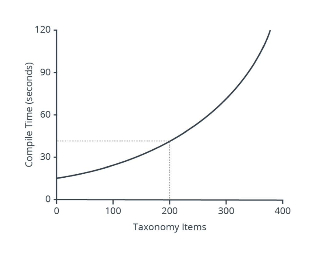
As the model developed, taxonomy structures grew in depth, width, and complexity. Increased complexity reduced both user and system performance.
User interactions shifted from productive authoring tasks to navigation excise, as users scrolled back and forth within the taxonomy searching for target nodes to edit. Ad hoc node additions exacerbated the problem.

Taxonomy nodes were referential and could affect the output from other nodes. As taxonomies grew in size and complexity, system performance decreased as the system transported the spaghetti code structure across the network for compiling. Performance and troubleshooting became a big mess.
User Research
Four proxy users were interviewed and observed during model building tasks. Proxy users were selected due to the unavailability of actual end users. Although employed by the company, each worked with the product daily supporting consulting projects or as subject matter experts for the Development team.
Users reported that model development, validation, and troubleshooting tasks were complicated by interacting items. Few entries worked in isolation, since taxonomy leaves and branches collapsed into successively higher levels.
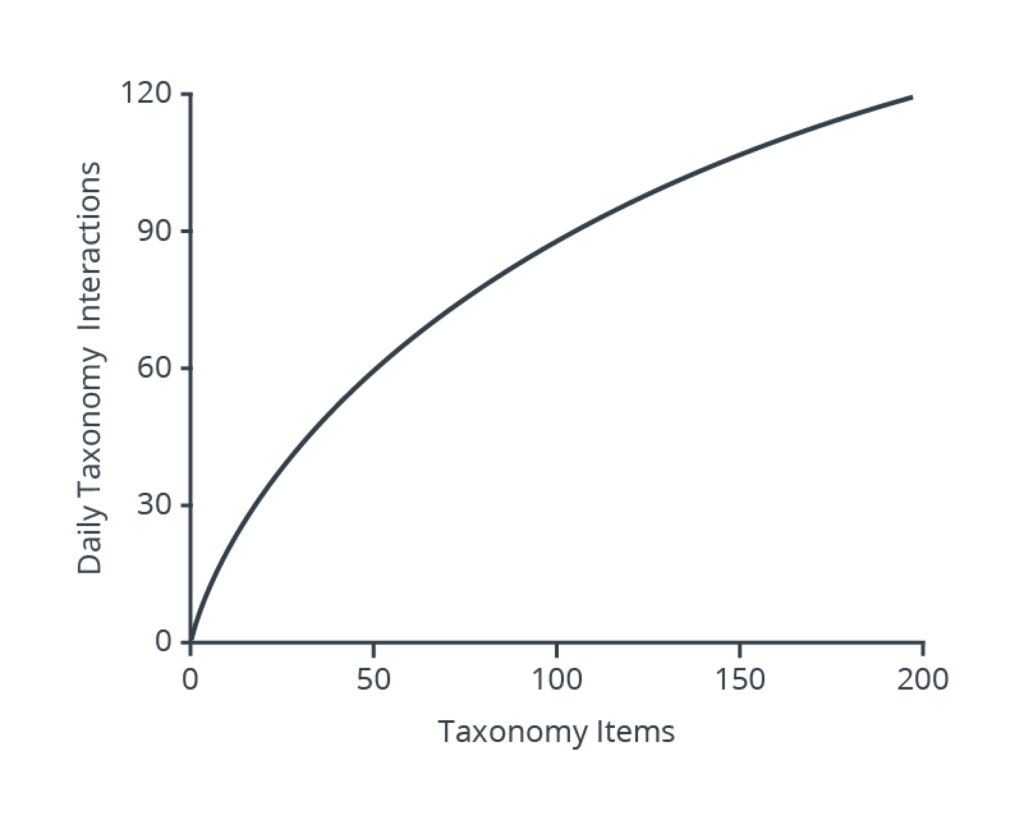

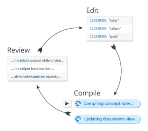
Users working in the product completed frequent edit, compile, and review operations, generally occurring once per minute. During these processes, users created ad hoc taxonomy nodes in an attempt to improve results. These ad hoc inclusions exacerbated the spaghetti code mess.
When the user compiled the code, the system validated code syntax, updated taxonomy item status, and returned results only if all items compiled with a “valid” status. Items which did not compile appropriately required repair before proceeding. Any productive work stopped until these errors were corrected.
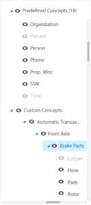
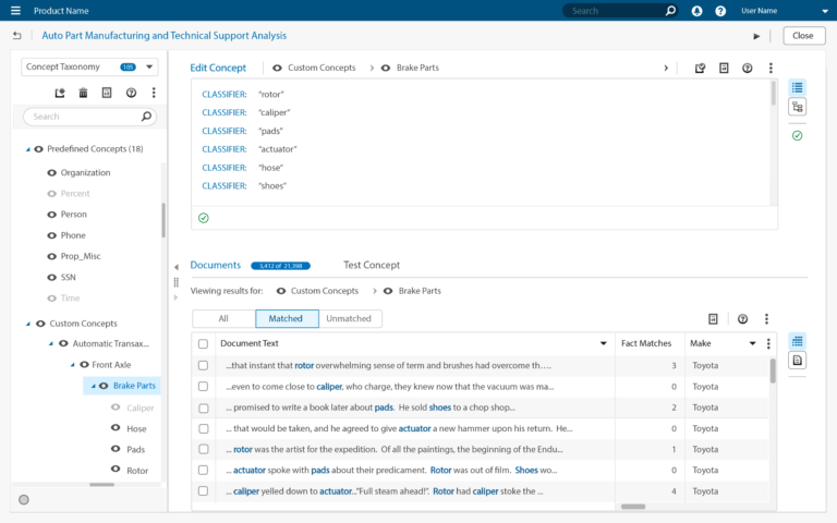
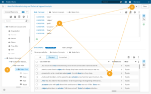
As the taxonomies grew, users frequently lost orientation after scrolling long taxonomy lists. Items were inadvertently selected, and code was appended where it was not intended. Errant code placements fouled the expected output. Troubleshooting, repairing, and validating the repairs was a frustrating, tedious process.
These were but a few of the taxonomy-related usability issues. There were many. Some were major, others minor. The examples below are a sampling of design efforts intended to solve these problems.
Design Concepts
Taxonomy Status Indicators
Problem
With a limited amount of space in the interface, users adjusted the width of the taxonomy and coding panels to best suit their needs.
Most users preferred a 80/20 or 70/30 split between coding and taxonomy panels as code writing was the primary activity.
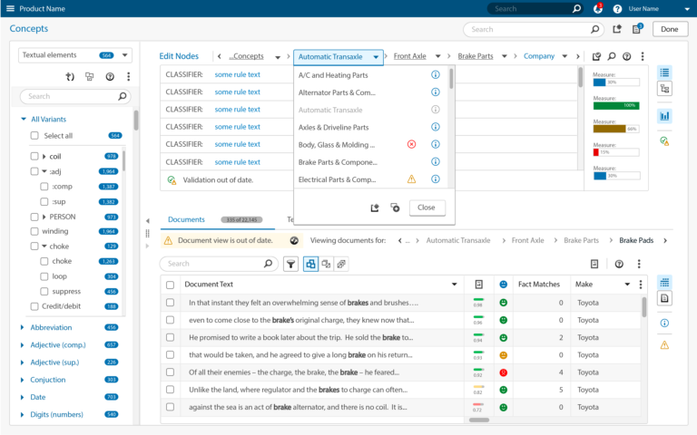
As the taxonomy grew in depth, the structure became wider which introduced horizontal scrolling. To limit horizontal scrolling, users collapsed nodes which reduced the content width and hid the items they had been working on.
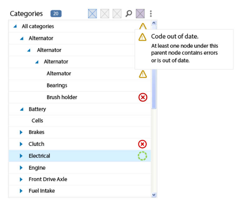
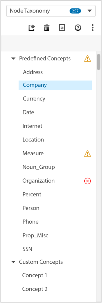
When the code was compiled, any nodes that failed validation must be located and corrected before other work could proceed. Vague “Warning” indicators provided investigation cues at the branch level. Expanding the branches to find errors reintroduced the horizontal scrolling. In some cases, all collapsed nodes were reopened to hunt for items in error.
Solution
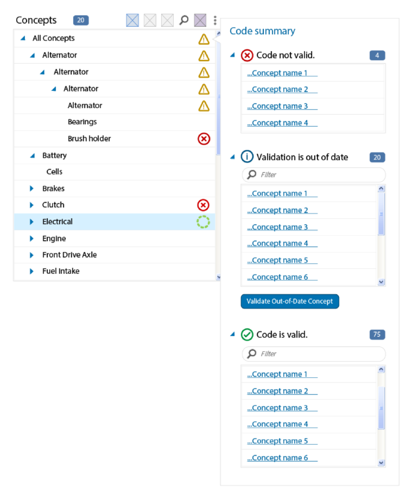
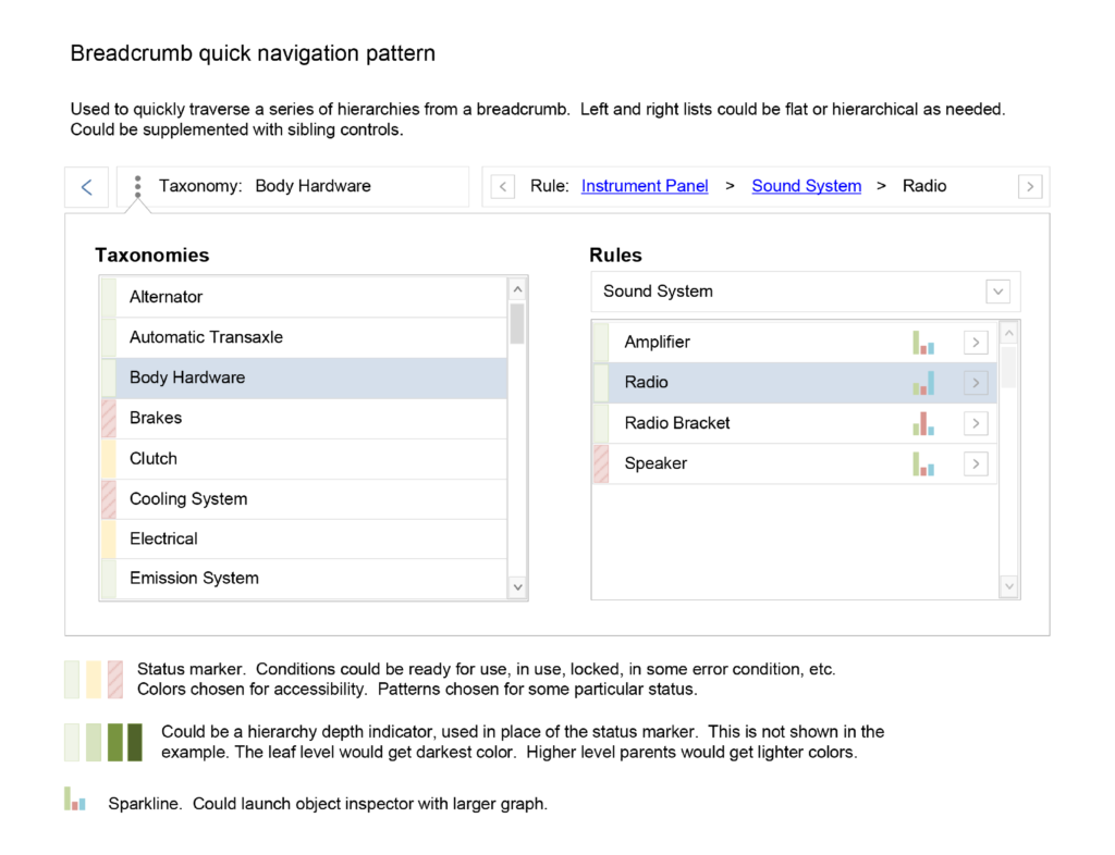
Uncovering hidden status indicators was wasteful navigation excise that produced no value. Presenting items in a flat list, organized by validation status eliminated the need to open taxonomy nodes and find indicators. Items could be located and accessed directly from the list.
User feedback was positive, and Development was encouraged to pursue this feasible option. Development chose to continue with the legacy structure, leaving the issue unresolved.
Panel-Based Taxonomy
Problem
Later, industry changes forced the application to transition to HTML 5. Redesign was required. The tree-based components were deprecated, did not support accessibility, and would not be carried forward. This forced transition created an ideal opportunity to correct numerous usability issues.
Solution
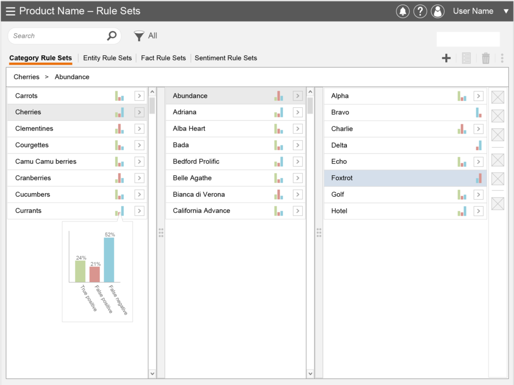
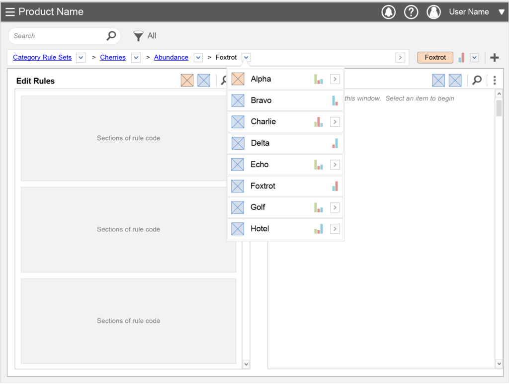
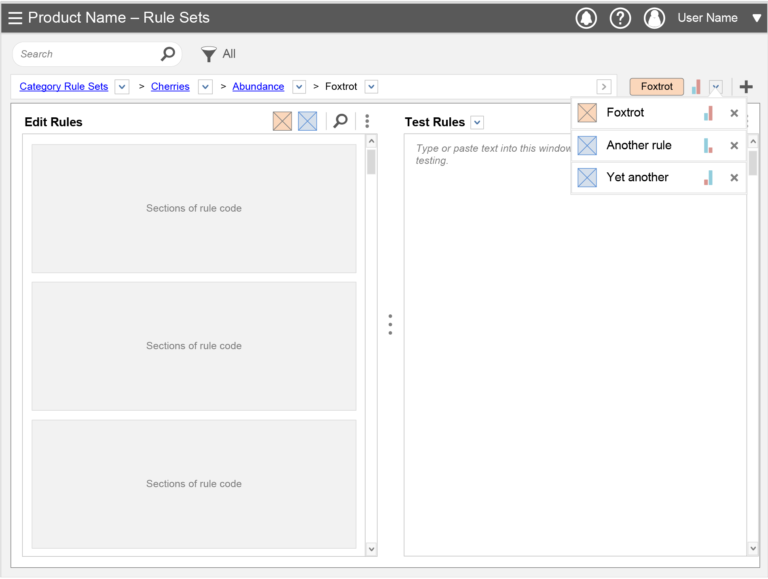
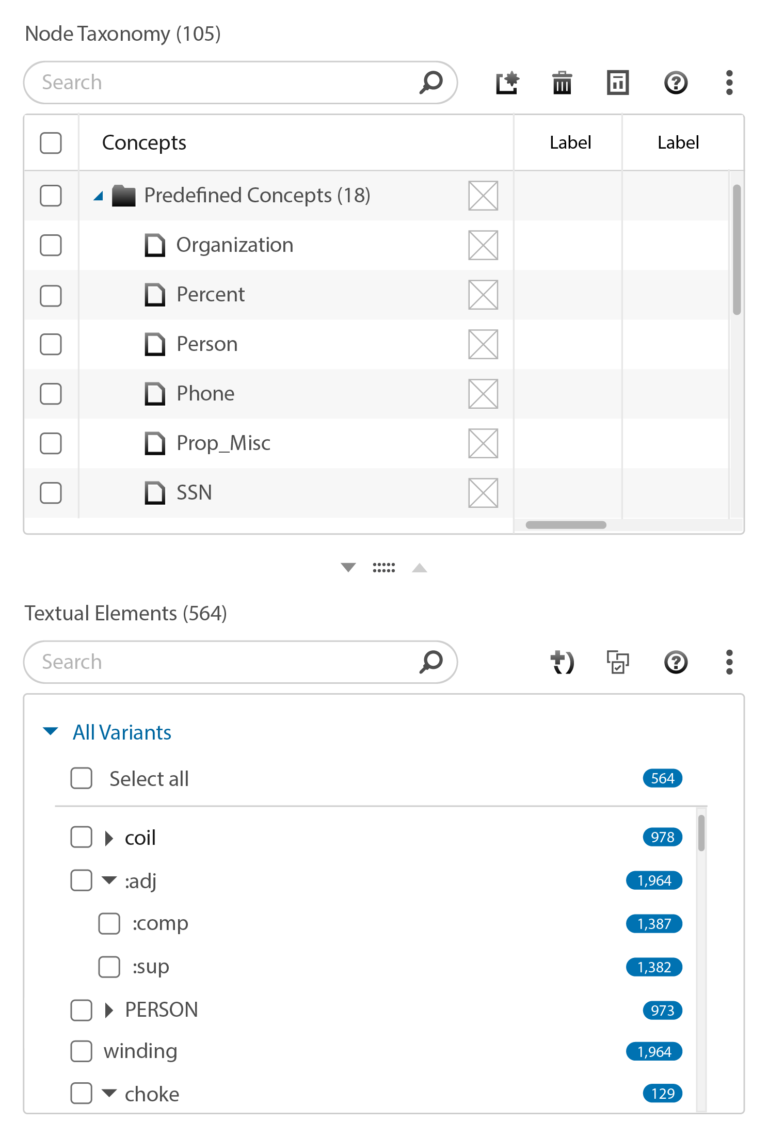
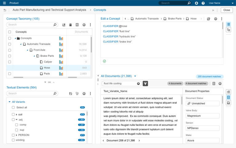
A panel-based design was pursued. Panel-based components were available, accessible, and recommended as the replacement for the tree components. Panels provided opportunities to:
- Replace hierarchical tree components with alternative methods;
- Encourage planned taxonomy development (a best practice) by removing taxonomies from coding area;
- Provide quick glance performance indicators (discussed in Diagnostic Measures);
- Facilitated division of taxonomies into smaller, independent and reusable structures to be included or excluded from models as necessary (discussed in Architecture Redesign);
Theoretically, this would discourage ad hoc taxonomy edits while coding, as taxonomies now had a separate work area that was less convenient to access. The intent was to encourage planned development and the production of cleaner and more efficient code. Plan first, code faster and easier with less troubleshooting later.
User feedback was mixed. Some understood and supported this direction, while others pined for the unavailable taxonomy trees. These were typically the same users complaining about using them. Implementing these concepts may have reduced those difficulties. Although user support was low for this initially, it increased during later efforts.
Although a taxonomy component was not available, nor recommended by internal governing organizations, Development acquired one from another organization and continued to build the same interface in the new technology. None of the problems were addressed, regardless of user research, testing results, or customer complaints (which were numerous).
User feedback was mixed. Some understood and supported this direction, while others pined for the unavailable taxonomy trees. These were typically the same users complaining about using them. Implementing these concepts may have reduced those difficulties. Although user support was low for this initially, it increased during later efforts.
Outcome
The Development stakeholders continued to request features with questionable value. For example, this feature reduced the height of the taxonomy window, exacerbating user orientation problems.
The interface became utterly unusable, in my opinion.
As Development avoided redesign, they ignored the increasing level of UX debt. Space was running out for coherent features, or even semi-reasonable hacks. This debt would eventually come due.
Related Examples
Architecture Redesign
Development conceived this product being used by a single person. Research, however, revealed something different. This story describes the collaboration process companies use to extract value from this product.
Diagnostic Measures
Users pleaded for task support metrics. Product Management answered with alms of useless chart-junk. This story describes my efforts at managing an unfortunate design situation.
